In-depth editor and junior Maddie Schutte discusses the design of the center spread with Hill. Every cycle, after first and second proof, Hill meets with page editors and their designers to discuss the design. In the case of this page, Hill was concerned about the mushroom cloud being too large.
|
|
My first journalistic love |
Coming from a childhood of art projects and crafts, I am a visually oriented person. Needless to say, I jumped at the chance to design during my sophomore year. I designed every cycle I could, which was cycle 2 through 11 my first year.
Before I knew it I became web editor and, because I was suddenly in charge of posting the vast majority of our content on our website, my short-lived design career came to a halt. Although I don't have time to fully design a page, I am still involved in the design of every print edition. While on-screening (the last review of the page before PDFing done by the editors-in-chief and our adviser), I make small changes in InDesign to make the page fit our stylistic choices. Throughout the cycle I also assist in looking for inspiration when designers are having trouble envisioning the page. One of the elements of design that was hard to learn was that design must be driven by content. All too often, I see designers trying to force a design before we have the photos or story in and it never works. I definitely did that during my first year, but now I understand that content drives design, not the other way around. |
Below are a series of pages I was the primary designer for. The samples are all from my first year on staff, because after that I had more responsibilities in other areas and didn't have time to fully design.
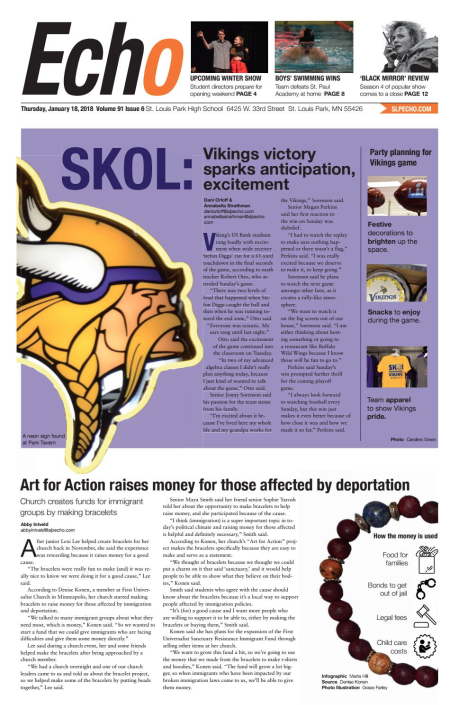
This page was the first time I had designed the front page, and it was intense. We didn't get the photo of the sign until almost 9 p.m., so it was a very late night. I am proud of how it turned out because it was challenging to get a photo for the Vikings story, but we figured it out.
|
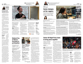
Looking back, what bothers me about this design is that several photos are competing for attention. If I could change it now, I would redesign the right-hand page to better suit the photos.
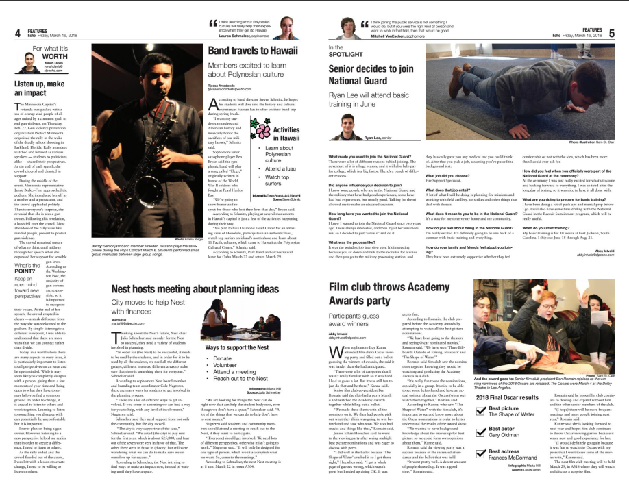
This design has some conflicting elements, but ultimately I am happy with how it turned out. Looking back I would have made the top right photo smaller. I think I did a good job using marginal photos and incorporating them into infographics.
|
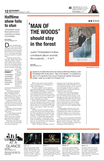
Typically, our entertainment page only has one story. This cycle I was challenged to put multiple stories on the page, while still designing an interesting page. Looking back, I like how the orange is pulled from the album cover and is seen throughout the page.
|
Beyond
|
All too often the Echo staff gets caught up in the print edition, and forgets that web should be a priority too. But, I strive to always keep the website updated and looking presentable. When I became Web Managing Editor that meant an overhaul of many parts of our website.
No one else on staff thinks twice about how the website is laid out, but I strongly believe the design of our website is key to increasing views and keeping readers engaged. The screenshots below are design restorations of the website at various points in the last few years. While the layout and widgets change, the content stays current. |
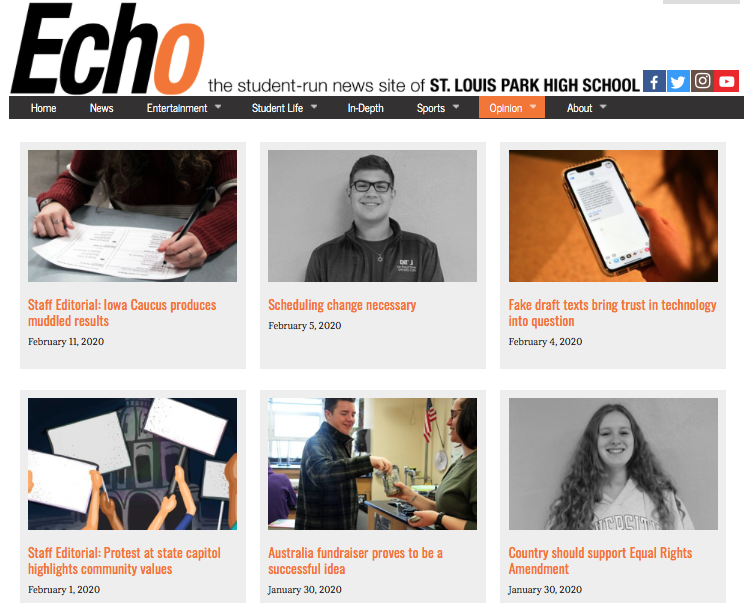
The opinions page of the website before I became web editor.
|
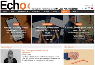
Opinions
When I first learned how to edit the layout of our website, the Opinions page was one of the first I tackled. There's nothing 'wrong' exactly with the earlier version, but it isn't interesting. I worked with the Opinions editor to figure out what categories to display. I am very happy with how it looks now. |
The opinions page after I redesigned it.
|
The news page of our website before I redesigned it.
|
The news page of our website after I worked on it.
|
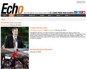
News
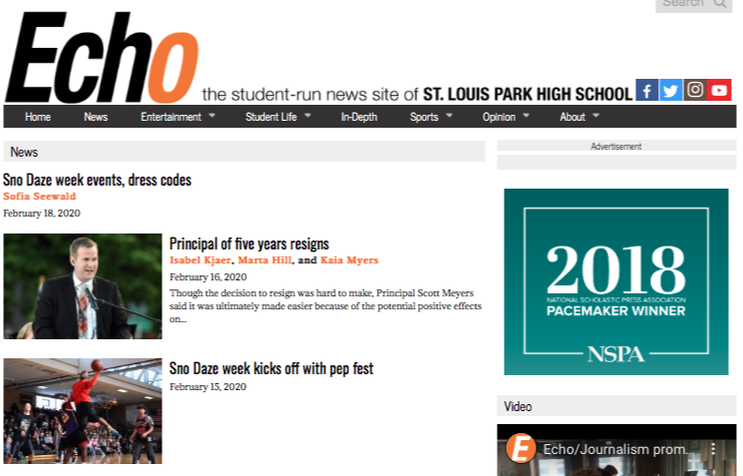
The state of the News page in 2018 was unfortunate. What bothers me most about that layout is the lack of space between the photos and the unnecessarily large amount of space devoted to the teaser for the story. There were several slight variations on the first layout, but ultimately I settled on the layout on the right. It does a better job showcasing the photos, while also incorporating elements like our Facebook feed. |
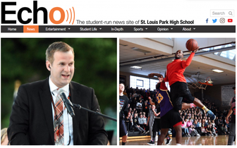
Home page
The home page of our website gets by far the most views. For this reason it is the page I focused the most on from a design standpoint. In my opinion the left most image doesn't do a good job of showcasing anything — photos, stories or videos. The second image is an improvement, but all too often the square crop of our photos did not display well. The current layout of our home page allows us to showcase three recent stories, and a bit of every content area if a viewer continues scrolling down. I enjoyed the process of redesigning the home page because there are so many options of how it could be laid out — but ultimately I am happy with how it looks now.
The home page of our website gets by far the most views. For this reason it is the page I focused the most on from a design standpoint. In my opinion the left most image doesn't do a good job of showcasing anything — photos, stories or videos. The second image is an improvement, but all too often the square crop of our photos did not display well. The current layout of our home page allows us to showcase three recent stories, and a bit of every content area if a viewer continues scrolling down. I enjoyed the process of redesigning the home page because there are so many options of how it could be laid out — but ultimately I am happy with how it looks now.
The home page of our website before I became web editor.
|
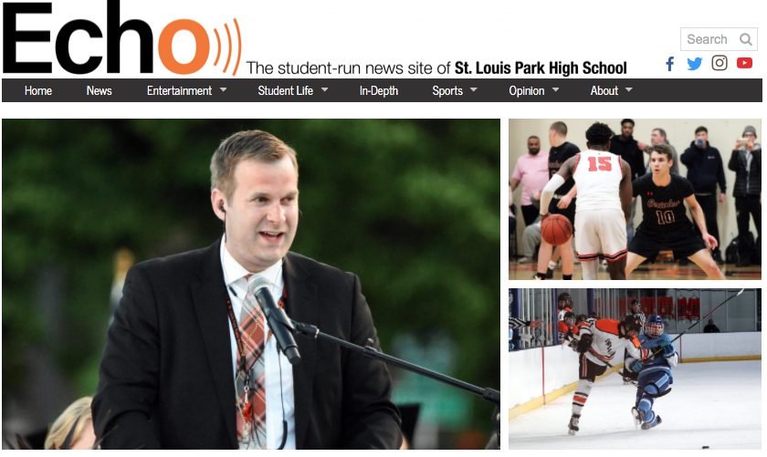
The home page of our website after I redesigned it.
|
